PrognoCIS Website
OBJECTIVE
In December 2017, I took the initiative to redesign key aspects of the PrognoCIS EHR website. The main objective of this project was to develop modern web experience while optimizing for lead generation and driving organic traffic via SEO.
RESULTS
Overall organic traffic to the site improved by 34% and led to increased time on site and higher quality conversions.
ROLE
I was the sole marketer on this project. I created user flows, developed an SEO strategy, designed wireframes, and hired a contracted developer to execute the final product.
PROCESS
Looking over past iterations of the website, I determined the visual elements were too crowded and the site navigation didn’t have a clear user flow for visitors.
To the left below is the original site design from 2013, and to the right is the result of redesigns from 2015-2016.
2013 design
2015 design
USER FLOWS & SEO
A major aspect of the redesign was implementing a user-friendly navigation that reflected a clear user flow directed towards target product pages and resources, which was also a vital to the SEO strategy.
I removed redundant multi-level items and reorganized the pages into categories based on the company’s business initiatives. Key visitor links, such as the Client Login and Search, were kept on the top nav bar for easy access, along with the addition of links to the Free Trial and Pricing. I also added a footer menu in order to create an index of key visitor pages.
The navigation headings were titled to include target keywords, we implemented a folder structure to properly categorize pages, and ensured pages across the site were properly linked to internal and external content.
Previous nav bar
Final nav bar
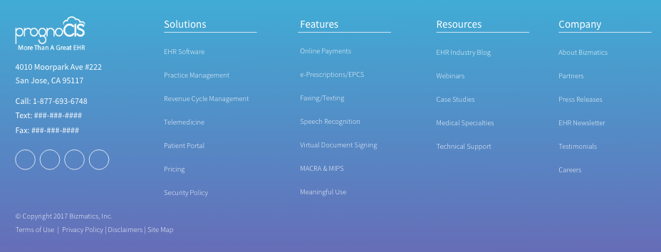
Website Footer
MOBILE OPTIMIZATION
Over the past year, the site's mobile traffic grew by 54%, resulting in a 59% increase in leads coming from mobile devices, so it was important to ensure the new website would be user-friendly on all devices and sustain lead generation.
Our main issue on mobile devices was the navigation and lack of content “above the fold.” I developed responsive wireframes to ensure key elements would be clearly visible on both mobile and desktop user flows. The navigation issue was mostly resolved as we restructured the site navigation - the previous mobile menu had two navigation bars, so I consolidated everything into an easily accessible and organized mobile nav with all key links readily available.
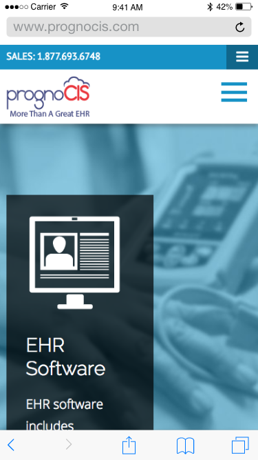
Previous mobile nav with two menus
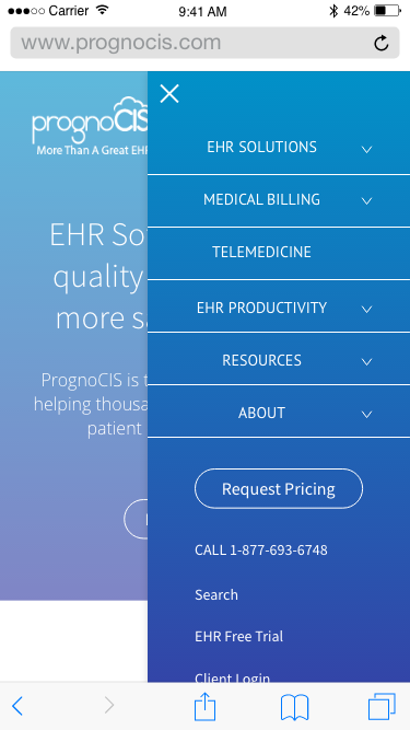
Redesigned mobile nav with single menu
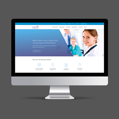
FINAL DESIGN
For a cohesive feel, I chose to emphasize the existing blue color for a softer feel, and added a bold gradient to accent visual elements. I selected lightweight sans-serif fonts, created an icon library to represent product solutions, features, etc., and finally, developed a brand style guide to begin documenting logo treatment, color, typography, etc.
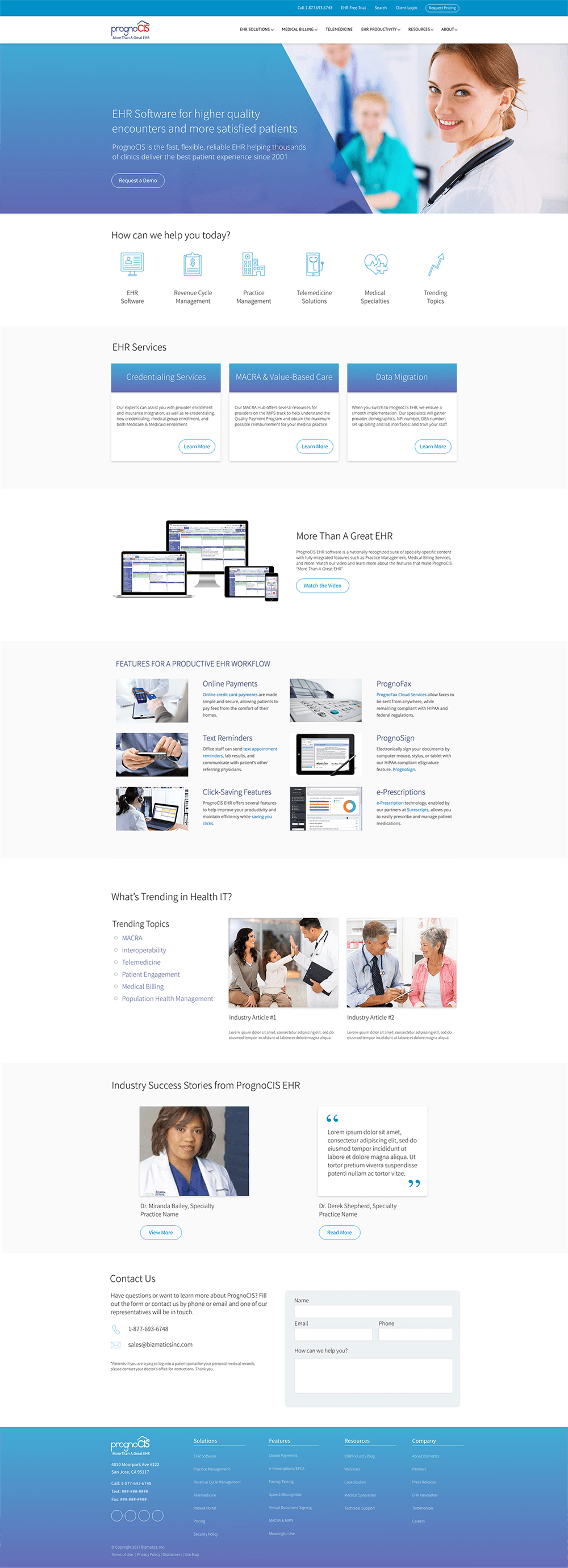
Final website design, December 2017